User Research & Redesign of Dell.com
Project with: Aaron Good, Ruby Sharma, & Napa Aramthanapon
Role: UI Designer & Researcher
Purpose: Conduct a usability test to discover and prove areas of improvement for the Dell.com user experience.
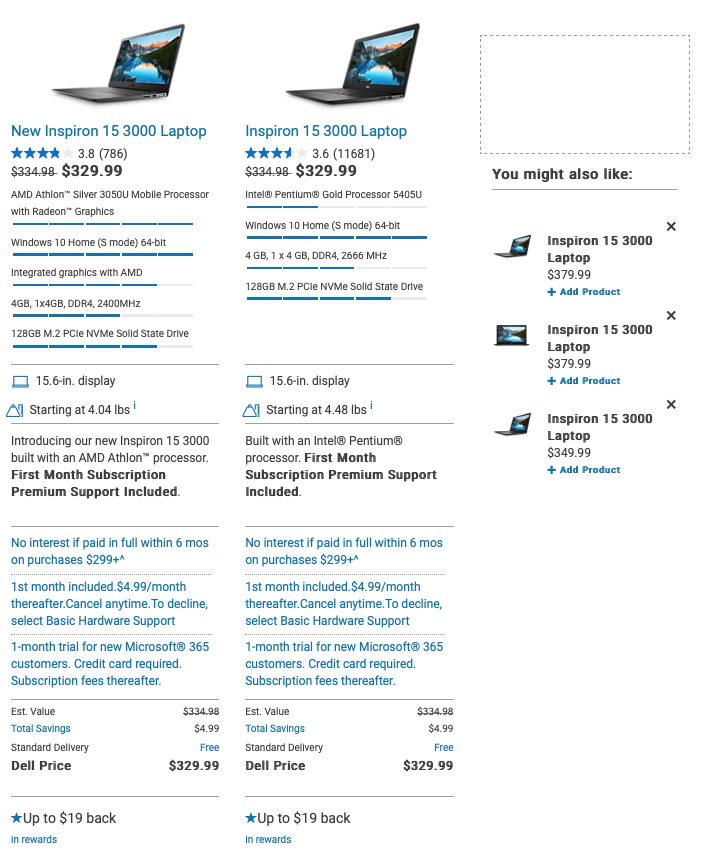
My team and I found that searching for a laptop was no small task on the Dell website. It’s complex and contains an overwhelming amount of information on display that creates cognitive load for people, making it difficult for them to find a computer they want and that meets their needs. The compare feature displayed too much information all at once and was not organized in a simplified manner. We want to fix that.
User Persona
Molly: 20-year-old sophomore in college
Works part-time in her college’s housing department
Makes less than $1000 a month
Engineering major
Plays 2 intramural sports
Always has her phone in hand
Our Users Goals:
Multi-function laptop- fast computer used for schoolwork, streaming & other everyday tasks.
Doesn’t want to spend a ton of money
Long-lasting battery life
Lightweight and durable
Pain Points:
Average knowledge of computers and technical specs
Lack of time for research on best type of computer that will meet her needs
Research Participant Summary
Demographics: Interviewed a total of 12 people
Ages range from 18-34
3 females & 9 males
7 students (undergrad & grad) & 5 working individuals
Computer Familiarity:
Average of 8.5 hours a day on a CPU (4.5 minimum, 12 maximum)
50% of participants have purchased a computer online before
Above average level of computer knowledge (3.6 out of 5)
Usability Test Summary
Inquired with users about their computer knowledge & preferences.
Scenario- Users are college students with a limited budget and who’s classes require them to have a touchscreen laptop.
Task 1 - Purchase a touchscreen laptop from Dell.com that would meet their needs as a student
Task 2 - Review your favorite laptop options, side by side, and all options are within the same price range
Assessment
Scored participants on:
User success & comprehension
Website clarity & ease-of-use
User likelihood to use Dell.com
User likelihood to recommend Dell.com
Measured participants:
Time to task completion
Mouse clicks
Verbal feedback
For Task 1, 100% completed the task however…
“The options are too overwhelming and organized in an unconventional way.”
“It feels more like work. It doesn’t feel like a good experience.”
Usability Issues: Comprehension is a Challenge
Not a easy comprehendible or minimalist design
Text-heavy & redundant
Imagery / iconography used sparsely
Oversaturated with non-pertinent info
Unorganized, not intuitive
Not flexible or efficient of use
Requires extensive reading
Collapsible information is rare
Filters do not provide ranges & reload page when selected
Lack of consistency & standards
‘Deals’ page different from ‘Laptops’ page
75% of users thought there was too much information and that it was difficult to understand.
67% of users could not distinguish between Dell’s 2 major laptop series: Inspiron and XPS
Only 2 users scored full comprehension
One had an expert level of computer knowledge
The other spent 7.2 more minutes and almost 3x the number of clicks than the average user
“There were so many options it would take me forever to go through and understand.”
Task 1 Conclusions:
It’s not difficult to buy, it’s difficult to buy what you want.
Lack of guidance
Dell does a poor job of presenting product differences and advantages
Users have to do all the work on their own
Attention spans are limited
Average user took almost 11 minutes to make their purchase
Over 50% ‘gave up’ and selected a laptop because they didn’t want to read anymore
Over 75% said they would need to do more research in a real-life situation
Students move more quickly - 2.1 fewer minutes and 2.4 fewer mouse clicks to purchase
Task 2: Review your favorite laptop options, side by side, and all options are within the same price range
Users stumbled while finding a way to compare their options. Dell.com is not intuitive.
Users faced difficulty in finding and using compare feature:
It is not consistent (missing in laptop deals page)
Users have to go back and forth the pages to compare laptops of their choosing
Users depend highly on filters to narrow their options for comparison
Only 1 out of 6 users was able to use compare feature flawlessly
Common problems:
Many users used the ‘back button’ to add another product to comparison
11 out of 12 users could not compare specific criteria of two products
“I would open two tabs side by side to compare laptops ”
Task 2 Conclusions:
Using compare feature is not easy:
10 out of 12 users would like to see improved compare feature
Increases cognitive load:
Average number of click were high (7.6). It underlines that the feature increases users’ cognitive load
Slows users:
Users took an average of 2.8 minutes to compare laptops
Results & Recommendations
Results:
High cognitive load
Lack of consistency and standards
Text heavy
Unorganized
Frustrated users
Poor reviews from users
Recommendations:
UI redesign to show less text to avoid cognitive overload
Simplify information
Add more white space
Larger visual displays
In comparing, prioritize differences between computers first
Stronger visual hierarchy


